css3中半圆怎么画?之前我们了解过,在CSS中想要实现圆角的效果可以使用border-radius属性来实现,而实现画一个圆就是将相邻两个角的值设置为宽/高度的一半,另两个角设置为0,这样就可以实现一个圆了。而半圆的画法其实也很简单,接下来小编给大家分享两种方法实现半圆效果。
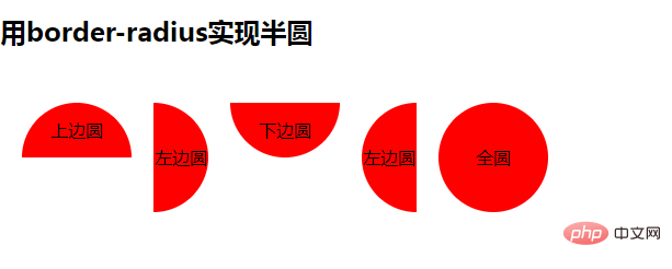
方法1:使用border-radius实现半圆
border-radius属性用于给元素设置圆角边框,可以指定1-4值,为边框创建(1~4个)圆角效果
语法:
border-radius: 1-4 length|%
每个半径的四个值的顺序是:左上角,右上角,右下角,左下角。如果省略左下角,右上角是相同的。如果省略右下角,左上角是相同的。如果省略右上角,左上角是相同的。
示例:
<!DOCTYPE html>
<html>
<head>
<meta charset="UTF-8">
<style>
* {
margin: 0;
padding: 0;
}

.clearfix {
zoom: 1;
/*为IE6,7的兼容性设置*/
}

.clearfix:after {
content: '.';
display: block;
height: 0;
clear: both;
visibility: hidden;
}

ul li {
list-style: none;
float: left;
margin: 50px 0 50px 20px;
text-align: center;
}

li {
background: red;
}

h2 {
margin-top: 20px;
}

.circle1 {
width: 100px;
height: 50px;
border-radius: 50px 50px 0 0;
line-height: 50px;
}

.circle2 {
width: 50px;
height: 100px;
border-radius: 0 50px 50px 0;
line-height: 100px;
}

.circle3 {
width: 100px;
height: 50px;
border-radius: 0 0px 50px 50px;
line-height: 50px;
}

.circle4 {
width: 50px;
height: 100px;
border-radius: 50px 0 0 50px;
line-height: 100px;
}

.circle5 {
width: 100px;
height: 100px;
border-radius: 50px;
line-height: 100px;
}

</style>
</head>
<body>
<div>
<h2>用border-radius实现半圆</h2>
<ul>
<li>上边圆</li>
<li>左边圆</li>
<li>下边圆</li>
<li>左边圆</li>
<li>全圆</li>
</ul>

</div>
</body>
</html>
效果图:
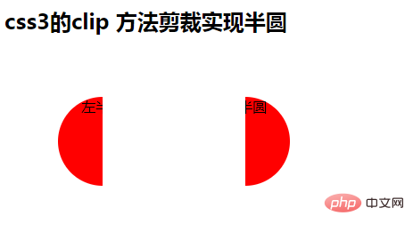
方法2:使用css3的clip 方法剪裁实现半圆
clip 属性剪裁绝对定位元素。也就是说,只有 position:absolute 的时候才是生效的。唯一合法的形状值是:rect (top, right, bottom, left)
示例:
<!DOCTYPE html>
<html>
<head>
<meta charset="UTF-8">
<style>

.clearfix {
zoom: 1;
/*为IE6,7的兼容性设置*/
}

ul li {
list-style: none;
float: left;
margin: 50px 0 50px 20px;
text-align: center;
}

li {
background: red;
}

h2 {
margin-top: 20px;
}


.demo {
/*左半圆*/
position: absolute;
/*clip 属性剪裁绝对定位元素。也就是说,只有 position:absolute 的时候才是生效的。*/
width: 100px;
height: 100px;
border-radius: 50px;
/* line-height: 50px; */
clip: rect(0px 50px 100px 0px);
/*唯一合法的形状值是:rect (top, right, bottom, left)*/
}

.right-circle {
/*右半圆*/
left: 200px;
clip: rect(0px 100px 100px 50px);
/*唯一合法的形状值是:rect (top, right, bottom, left)*/
}


</style>
</head>
<body>
<div>
<h2>css3的clip 方法剪裁实现半圆</h2>
<p style="color: red;"></p>
<ul style="position: relative;">
<li>左半圆</li>
<li class="demo right-circle">右半圆</li>
<li></li>
</ul>
</div>
</body>
</html>
效果图:
以上就是css3半圆怎么画的方法介绍了,上述实例对大家学习CSS3的使用有一定的帮助,需要的朋友可以借鉴学习,想要了解更多请关注群英网络其它相关文章。
Copyright © QY Network Company Ltd. All Rights Reserved. 2003-2018 群英 版权所有 茂名市群英网络有限公司
增值电信经营许可证 :
B1.B2-20140078
粤ICP备09006778号-36
 粤公网安备 44090202000006号
粤工商备P091701000595
粤公网安备 44090202000006号
粤工商备P091701000595